Name of Artist: Jim Scherer
Dates of Artist’s Life: January 3, 1974- Now
1. Personal Background:
When Jim was six he says his dad gave him a little plastic camera. That's how his love for photography all started. In college he started out as a art major. He says he tried to take as many photography courses as he possibly could. After he finished college with a BA in studio art he moved to Boston. He was interested in commercial photography and had been thinking about trying it. Jim was in Boston Globe’s Sunday Magazine with his photography featured for more than 30 years. After assisting in many commercial studios he was asked to shoot a cookbook with Julia Child. While shooting it he says he was greatly influenced by her passion in it.
2. Style:
When it comes to lighting with the daylight he likes to “add just a little bit of sparkle.” He does this by using low raking lights to add some pop to any photos that might be just looking a little bit flat. Also Jim like to point out characteristics in objects that other people may not notice for example the seeds on a fruit or any little design on a object. He likes to hide a story in every photo by using details which the viewer has to try to look for. “When you have to look for it, it shows how much visualizing you have to do with once piece of photography,” he says.
3. Philosophy:
When Jim takes his photos he takes objects and gives them a purpose. He looks at the foods trying to find it’s unique and interesting purpose and how it’s different from anything else he has taken photos of. He wants to point out the differences each food has in his photography. Once he shoots the photo he says the unnecessary things within the photo he takes out to make the image even more interesting to look at. Then when he is finished with the photo he wants it to be deep, as if when you look at it you can imagine what he is trying to say by the color or texture of the object he was photographing.
4. Influences:
This photographer has inspired me a lot in his photography because he makes me look deeper in his work than just taking a picture. Even if it’s just a image of an object the object could be trying to do something that the photographer wants me to notice. Even if I don’t or can’t notice it right away it means that he is trying to make us look at the photo in different ways. It inspires me how much thought he puts into taking and planning the photos so the viewer understands the meaning behind the photo. He shows color and every little detail he creates has a big effect in the photos when you are trying to think about it.
Sources:
“Best of 2014 Honoree: Jim Scherer.” ASMP, 6 Mar. 2017, www.asmp.org/best-of-2014/jim-scherer/.
says, Marcello Arena, et al. “Q&A With Food Photographer Jim Scherer | Summer Food Photography Series Part Six.” Gourmande in the Kitchen, 6 Aug. 2012, gourmandeinthekitchen.com/food-photographer-jim-scherer/.
“About Jim Scherer.” Jim Scherer Photography, jimscherer.com/about-jim-scherer/.
“Still Life.” Jim Scherer Photography, jimscherer.com/photography/still-life/.
6. Compare and Contrast:
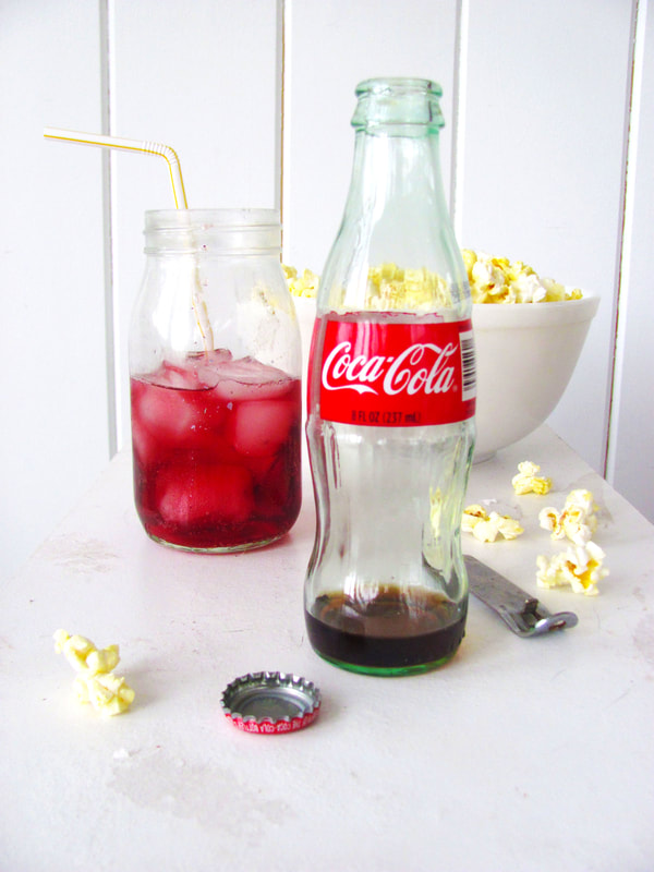
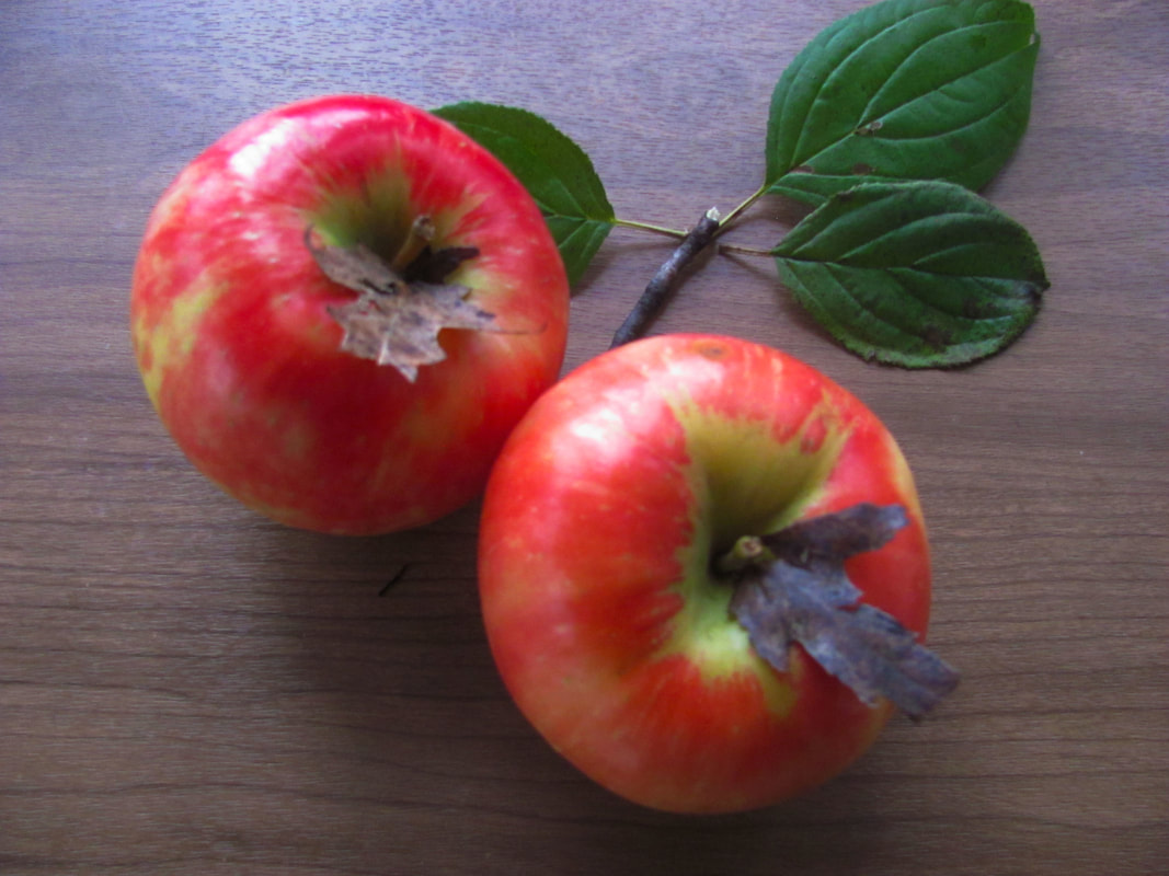
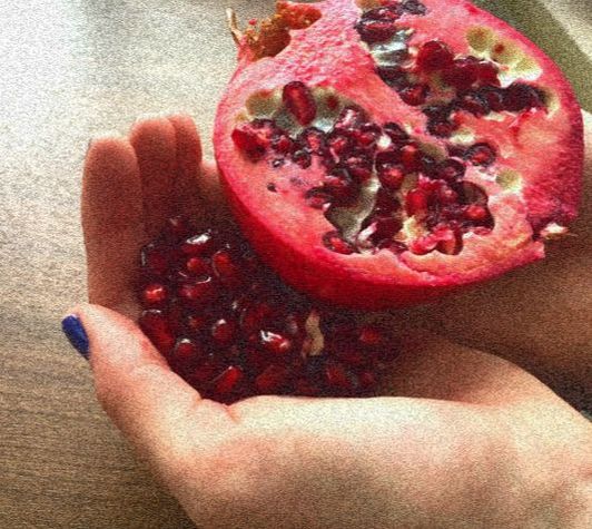
My first piece was with the bottle of cocoa and my brother helped me drink it. Also my brother got the popcorn and helped me set the scene to take the pictures. The other drink in the background is sparkling red grape juice with the same yellow straw. The next picture with the apples I went outside to get some leaves to place next to and on the apples just like in the real picture. Then in my last picture with the Pomegranate I had to open the Pomegranate and take out all the seeds on one side. My brother held the other side of the Pomegranate while I held the seeds so I was still able to take the pictures.
7. Personal Artist Statement:
My first picture with the cocoa uses framing. This picture is very layed out in showing a scene that is happening. The next picture I took was of the apples, I took the photo from above to make sure the apples and leaves were in frame. Then the last picture with the Pomegranate I used the experimentation filter. The filter makes the image look more pixelated and have more features.
Dates of Artist’s Life: January 3, 1974- Now
1. Personal Background:
When Jim was six he says his dad gave him a little plastic camera. That's how his love for photography all started. In college he started out as a art major. He says he tried to take as many photography courses as he possibly could. After he finished college with a BA in studio art he moved to Boston. He was interested in commercial photography and had been thinking about trying it. Jim was in Boston Globe’s Sunday Magazine with his photography featured for more than 30 years. After assisting in many commercial studios he was asked to shoot a cookbook with Julia Child. While shooting it he says he was greatly influenced by her passion in it.
2. Style:
When it comes to lighting with the daylight he likes to “add just a little bit of sparkle.” He does this by using low raking lights to add some pop to any photos that might be just looking a little bit flat. Also Jim like to point out characteristics in objects that other people may not notice for example the seeds on a fruit or any little design on a object. He likes to hide a story in every photo by using details which the viewer has to try to look for. “When you have to look for it, it shows how much visualizing you have to do with once piece of photography,” he says.
3. Philosophy:
When Jim takes his photos he takes objects and gives them a purpose. He looks at the foods trying to find it’s unique and interesting purpose and how it’s different from anything else he has taken photos of. He wants to point out the differences each food has in his photography. Once he shoots the photo he says the unnecessary things within the photo he takes out to make the image even more interesting to look at. Then when he is finished with the photo he wants it to be deep, as if when you look at it you can imagine what he is trying to say by the color or texture of the object he was photographing.
4. Influences:
This photographer has inspired me a lot in his photography because he makes me look deeper in his work than just taking a picture. Even if it’s just a image of an object the object could be trying to do something that the photographer wants me to notice. Even if I don’t or can’t notice it right away it means that he is trying to make us look at the photo in different ways. It inspires me how much thought he puts into taking and planning the photos so the viewer understands the meaning behind the photo. He shows color and every little detail he creates has a big effect in the photos when you are trying to think about it.
Sources:
“Best of 2014 Honoree: Jim Scherer.” ASMP, 6 Mar. 2017, www.asmp.org/best-of-2014/jim-scherer/.
says, Marcello Arena, et al. “Q&A With Food Photographer Jim Scherer | Summer Food Photography Series Part Six.” Gourmande in the Kitchen, 6 Aug. 2012, gourmandeinthekitchen.com/food-photographer-jim-scherer/.
“About Jim Scherer.” Jim Scherer Photography, jimscherer.com/about-jim-scherer/.
“Still Life.” Jim Scherer Photography, jimscherer.com/photography/still-life/.
6. Compare and Contrast:
My first piece was with the bottle of cocoa and my brother helped me drink it. Also my brother got the popcorn and helped me set the scene to take the pictures. The other drink in the background is sparkling red grape juice with the same yellow straw. The next picture with the apples I went outside to get some leaves to place next to and on the apples just like in the real picture. Then in my last picture with the Pomegranate I had to open the Pomegranate and take out all the seeds on one side. My brother held the other side of the Pomegranate while I held the seeds so I was still able to take the pictures.
7. Personal Artist Statement:
My first picture with the cocoa uses framing. This picture is very layed out in showing a scene that is happening. The next picture I took was of the apples, I took the photo from above to make sure the apples and leaves were in frame. Then the last picture with the Pomegranate I used the experimentation filter. The filter makes the image look more pixelated and have more features.
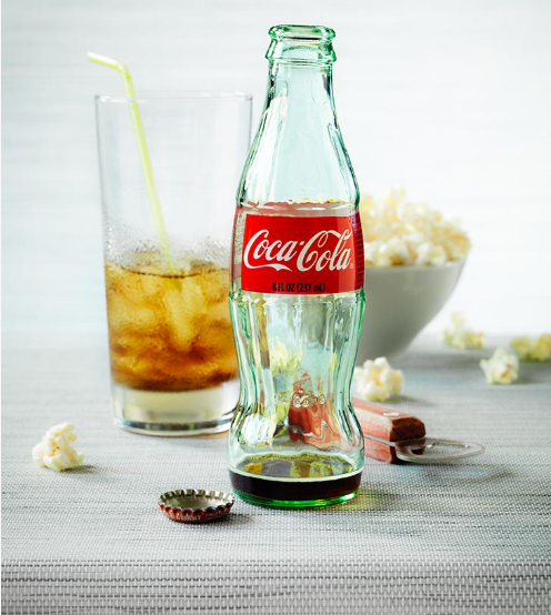
Cocoa (http://jimscherer.com/)
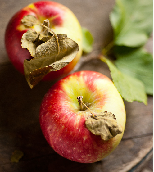
Apples (http://jimscherer.com/)
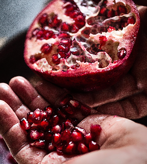
Pomegranate (http://jimscherer.com/)
|
Ready for the Day
The Colors
Hand Fool
|
